
Bollinger / Multiboard Board Help


We use or own Product a developed variant off a double Band Bollinger Strategie developed 2010 , Bollinger (1980) perfect for commodities not the FIB Retracement (developed 12- 14th Century ) for High Frequency Trading .
Why so many forms of Technical Analysis ?
Multiboard offers 12 types (off ~120) of Analysis, at least 9 are needed. - The reasons under many are warning signals , ... before a Crisis happens .
The completed History off Crisis from the Beginning in the 16th Century Tulip mania
Tulip mania or "Black Tuesday": There have been many in history ... Share index (Dax), for example, has lost around 30 percent since mid-February.
The tulip mania is a period in the Dutch Golden Age when tulip bulbs became an object of speculation. Tulips have been a popular item since their introduction to the Netherlands in the second half of the 16th century
.
.
.
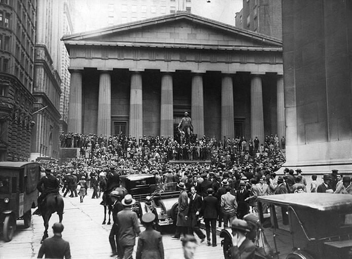
1929 Black Monday
The Dow Jones lost 89.0% by 1932> 25 years> Complete recovery from the price loss in 1954
Terms such as “Black Thursday”, “Black Monday” and “Black Tuesday” all have their origin in October 1929. In the eight previous years, the Dow Jones Index had increased more than sixfold to 381 points. An impending economic downturn caused panic among investors, which was exacerbated by the collapse of the still “new” technologies - telephones and price tickers. The Wall Street crash was followed by the "Great Depression" - the worst economic crisis of all time.
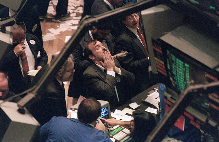
1987 Black Monday
The Dow Jones lost -40.1% in the crisis> 1 year, 10 months> Complete recovery from the price loss on 08/25/1989
Like most other crises on the stock exchanges, “Black Monday” cannot be reduced to one day - Wall Street had already suffered heavy price losses before that. However, October 19, 1987 marked the climax with losses of 20 percent in the broad Standard & Poor’s 500 index. What makes the crash unique: To this day, no one agrees what the trigger was. However, experts suspect a herd instinct, which ultimately leads to a mass panic on the floor
2001 terrorist attack on September 11th
The Dow Jones loses -24.9% in the crisis> 6 years, 9 months> Complete recovery from the price loss on: October 6, 2006
The images of the terrorist attack in the USA in the summer of 2001 and the collapsing twin towers in New York will stay in most people's memory forever. The price losses on Wall Street associated with the attack were, however, only part of a crisis that had already started the year before - the bursting of the Internet bubble - and which continued until 2002. During this phase, the Dow Jones lost a total of 25 percent in value and the technology-heavy Nasdaq Composite 67 percent. Phase loss off Dow Jones insgesamt 25 Prozent an Wert ein und der technology stock weighted Nasdaq Composite 67 Prozent.
2008 financial crisis September 16
The Dow Jones lost -43.7% in the crisis> 2 years, 3 months> Complete recovery from the price loss on: December 17th, 2010
A massive drop in prices on the US real estate market in the summer of 2008 sent shock waves through the American financial system and brought many banks and mortgage financiers to the brink. The investment bank Lehman Brothers filed for bankruptcy. The crisis reached Europe within a few weeks, southern countries such as Greece were threatened with bankruptcy and the euro would end. The Dow Jones lost around 44 percent of its value by spring 2009.
2010 Flash crash May 6th
The Dow Jones lost -11.7% in the crisis> 5 months, 16 days> Complete recovery from the price loss on: October 22nd, 2010
The crisis on Wall Street, which went down in history as a “flash crash”, is the shortest of all time with a duration of only 36 minutes. The losses in the stock markets during this period were enormous, however, running into the trillions. High-frequency traders who aggressively sold positions during the beginning of the downturn in order to limit losses - and thus ultimately accelerated the fall - are considered to be the cause of the price slump, which was caught up again within an equally short period of time.
2020 Coronavirus February to?
-35.0% does the Dow Jones lose in the crisis>?
In terms of speed, the current stock market crash is the toughest of all time. The DAX lost 40 percent of its value within four weeks, the Dow Jones 35 percent. The slump on the stock exchanges that began in mid-February can be traced back to the uncontrolled spread of a new type of coronavirus that first appeared in China just before the turn of the year. Since then, it has been spreading rapidly around the globe with undreamt-of consequences for people and the economy. Economists therefore expect a global recession for 2020.
Momentum - CCI (Commodity Channel Index) - RSI (Relative Strength Index) - ROC (Rate of Change) - MFI (Money Flow Index) - (OB / OS (Overbought / Oversold) ) - Stochastics - (Slow stochastics) - Williams Percent Range
1) Momentum
Course as a plaything
Calculation depending on the interval
Interpretation and recommendations for action
Signals of momentum
Tips for aspiring chart analysts
2) CCI (Commodity Channel Index)
Also for analyzing stocks
CCI for trend determination
Unsuitable for stable trends
What should investors keep in mind with the CCI?
3) RSI (Relative Strength Index)
Implementation of the RSI
What do the results determined by the RSI mean?
More options of the RSI
4) ROC (Rate of Change)
Momentum and ROC measure the power of movement
Calculation of the rate of change
5) MFI (Money Flow Index)
How the MFI is calculated
Recommendations for action for analysts
6) Stochastics
Basics of the stochastic indicator
Buy and sell signals from stochastics
Meaning of the signals of the stochastic indicator
Beware of false signals
7) Williams Percent Range
When is the% R suitable?
Buy and sell signals for the Williams Percent Range1)


Main : Bollinger (1980) - MCAD - FIB Retracement (14h Century)
+ We offer make a Choise ( all over 120 ) :
+ 12 Standart Oscillators
+ 64 Technical Chart Oscillators
Finally the Fibonacci retracement but the disadvantage everyone uses that it becomes a self-fulfilling prophecy and thus dangerous. Please also note Bollinger and MCAD. Fibonacci retracements are a popular trading tool used by chart technicians. In certain phases, traders can use it to forecast certain price movements. Here you will learn how to do it step by step.
Fibonacci retracements come from 14th century mathematics.
The Fibonacci sequence is one of the most famous formulas in mathematics. Each number in the sequence is the sum of the two numbers that precede it. Pay attention to it:
0, 1, 1, 1, 2, 3, 5, 8, 13, 21, 34 and so on. The math equation it describes is Xn + 2 = Xn + 1 + 1 + Xn.
The curious thing is that we encounter the Fibonacci sequence every day, especially in art and nature.
Yes, I know you want to understand the relationship between the Fibonacci sequence and stock market trading. That's exactly what we're looking at now.
How is the Fibonacci retracement used in trading?
The method of Fibonacci retracement can be used amazingly precisely in trading to predict price movements. It is a classic instrument of the chart technique.
One of the pioneers in charting was Ralph Nelson Elliott. For Elliott, stock markets move in waves, similar to the natural tides in the ocean. A bull market therefore corresponds to the high tide, which will be replaced by the ebb (bear market) at some point.
Elliott used the Fibonacci sequence of numbers to predict the extent of the ebb (i.e. the course correction).
He divided the distance between the high and low point of a movement according to the rules of the golden ratio.
As a result, three important brands emerged that are of great importance. In addition to 38.2%, there are both 50% and 61.8%.
Keep these brands in mind!
Because precisely these brands are significant resistance and support zones in chart technology.
It is sometimes frightening how exactly the course is turning on these brands.
Where can I find the Fibonacci retracement and how do I create it?
We generally use this tool to determine the end of a correction.
What was another correction?
It is the countermovement to a long movement within a trend.
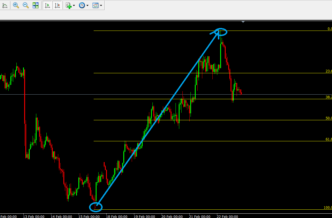
In the picture we only see a downward trend. This consists of downward movements (blue) and corrective movements (pink). Since it is a downtrend, the downward moves are longer than the short intermediate corrections.
As always, a trend is over at some point and a trend change occurs (here green arrow). This is followed by long upward movements with short intermediate corrections.
Some traders have missed entry into the uptrend and still want to get into the market somehow.
The questions a trader asks himself over and over again are:
"Do I wait and risk that the trend will continue without me?"
"Has this movement now ended and does a correction follow?"
"Yes, it is a correction, but where could it end so that I can find a good start?"
In order to be able to make a better decision for or against a trade, traders use various tools. They can be technical or fundamental indicators.
The Fibonacci retracement is a technical indicator and helps us to determine the possible end of a corrective move.
Above we saw a long upward movement. The question now is, where can I find the tool?
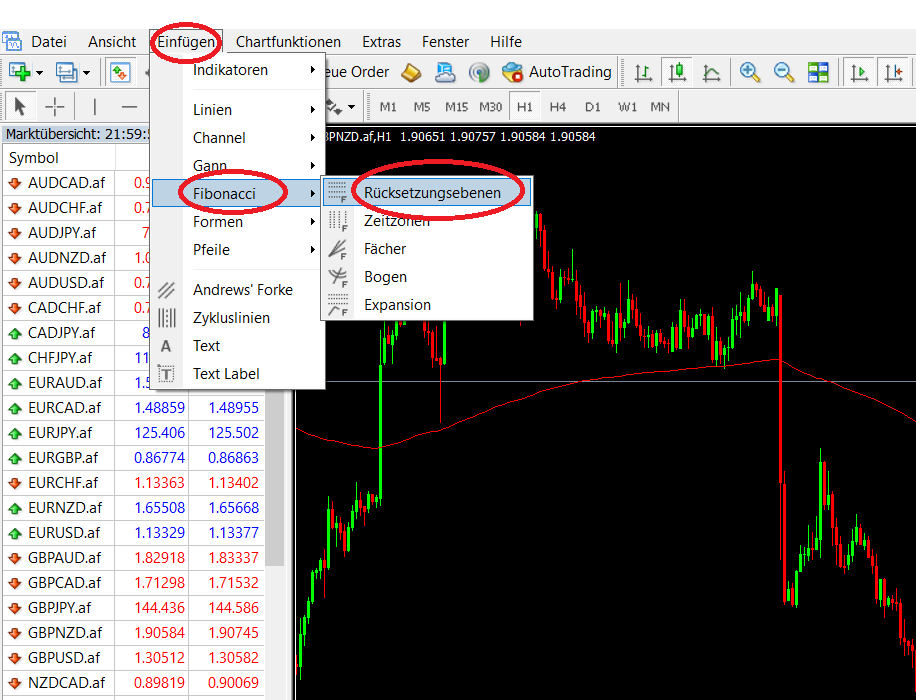
If you work with the Metatrader, you can find it in the menu under "Insert" -> "Fibonacci" -> "Reset levels".After a long upward movement, there are always corrective movements.
With the help of the Fibonacci retracement, we now want to anticipate how far the correction could go or where it will end and an entry in the direction of the trend is worthwhile.
So if we see a long upward (or downward) movement stalling and a top (or bottom) forming, then we can apply the Fibonacci tool to the entire route. The longer the route, the better.
Then click on the Fibonacci tool in your chart software and drag it from the low point to the high point with the mouse button pressed
When do I use the Fibonacci retracement in the chart?
We already know:
The tool then automatically inserts the selected reset levels.
The 0% are at the end of the movement (here at the top), followed by 23.8%, 38.2%, 50.0%, 61.8% and the beginning of the movement (100%).
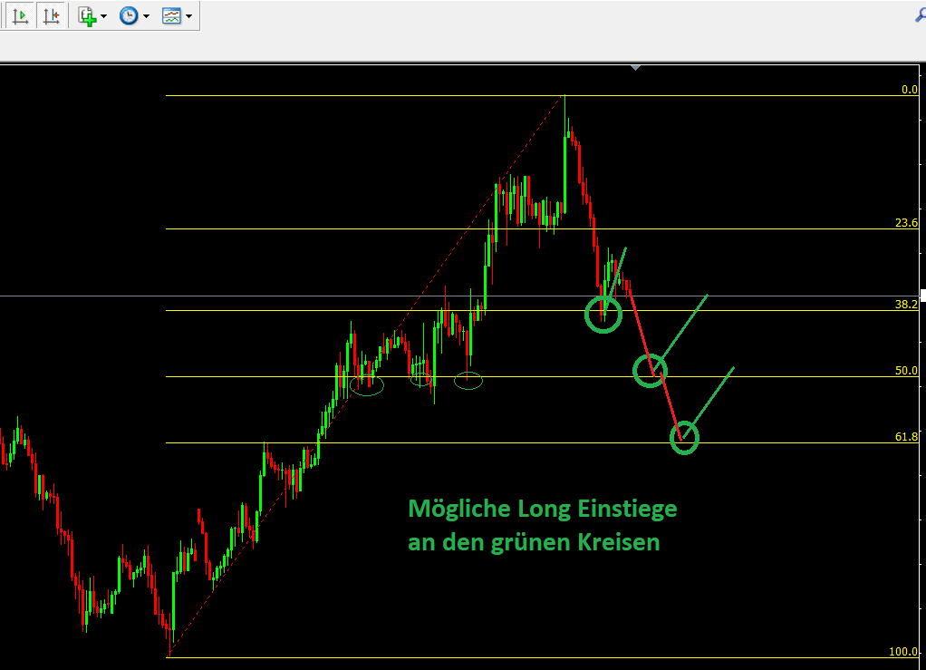
As mentioned above, we are concentrating on the 38.2, 50.0 and 61.8 brands. There we can then rely on a rebound by making a long entry. If there was a downtrend here, we would trade short accordingly.
.Now that you know WHERE to find the Fibonacci retracement, we need to clarify WHEN you can use it.
In this case we are looking for a long entry because the trend is overriding long and we are looking for a good opportunity to participate in the long wave.
In the picture you can see that the price has already reached the 38.2 level and has first rebounded. As it stands, this is not sustainable and the course goes one floor lower. Maybe up to the 50s level?
If we look at the three main trading styles (scalping, day trading, swing trading), the entry price can be the same for all of them. Anyone who believes in the end of the correction and the resumption of the upward trend places their buy limit order and waits until the price reaches the level.
The entry can therefore be chosen the same for all trading styles. The traders bet on a rebound at the respective Fibonacci level.
Now the wheat is separated from the chaff.
The scalper only wants to take a short rebound of 5 or 10 pips or points and is then already done. He is not interested in whether the trend will really continue or whether it will end. He just wants to see a jolt in the order book and take advantage of this preponderance of buyers.
The day trader wants to see more. For example, he aligns his take profit with the last day's high and might want to take 20-100 pips.
The swing trader is even more relaxed and wants to experience not only a return to the top, but also a trend continuation beyond that.
And just as the Take Profit is chosen, the Stop Loss must of course be chosen on the other side. Everything in line with the position size.
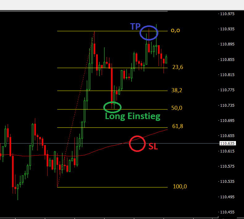
The following picture serves as an example for a day trade. An upward movement was discovered here. The course found its top and started correcting it. Only then could the trader use the Fibonacci tool and draw in the reset levels.an
He decided to enter at the 50.0 level, a stop loss protection below the 61.8 level and a take profit at the last local high point
A few more tips on Fibonacci retracement:
The current movement is always considered.
Combine the Fibos 38, 50 and 61 with a support level or a resistance level (see charts)
Use Fibos initially in larger time units from a 1h chart
The Fibos work well in higher time units because many market participants (including institutional investors) pay attention to these levels and place their orders accordingly.
Above all, the 50.0 level is very popular among traders and speculators. The chance of a winning trade is increased if further indicators such as pivot points or resistance / support zones are in this target area.
Of course, you can also trade downtrends with the help of the Fibonacci retracement. As mentioned, the aim is to find a way back into a trend with the help of this tool.
What are Fibonacci extensions?
We have covered the Fibonacci retracement in detail. It is a standard measure of support and resistance levels in the market. These values are calculated by analyzing the retracement levels between two highs and lows (trend). The next question we need to ask ourselves as traders is what happens if the price exceeds the swing points we use to calculate our Fibonacci values?
At what point do we want to close our position? Is there perhaps another possibility than the method already presented to use the last local highs (or lows in the case of short)?
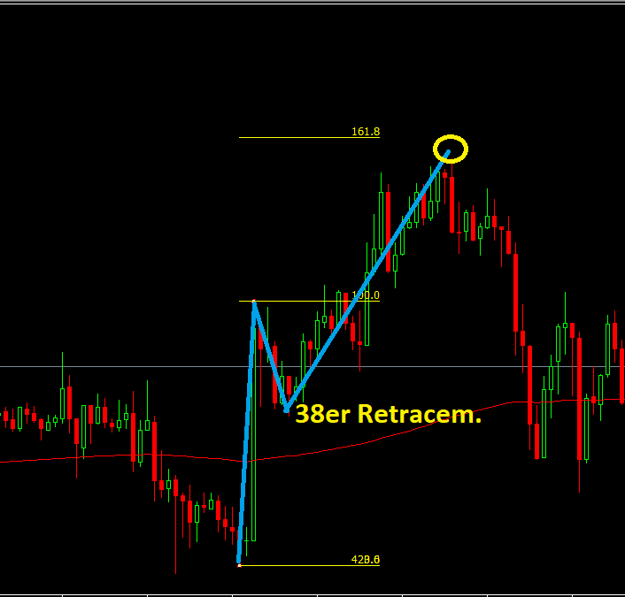
This is where the Fibonacci extensions come into play. Fibonacci extensions provide price targets that go beyond 100% retracing a previous move. Fibonacci expansion levels are calculated by taking the ordinary Fibonacci levels and adding them to 100%. Therefore, the extension levels for Fibonacci are as follows: 138.2%, 150%, 161.8%, 231.8%, 261.8%, 361.8% and 423.6%.
Particularly the 150 and 161.8 are taken into account here. Attached an example.
This tool can therefore be used to set the course target.
You can individually select the respective levels in Metatrader 4 by right-clicking on the drawn Fibonacci retracement route.
Conclusion:
Fibonacci retracements are of course not an all-purpose weapon. There is no such thing in trading. Here probabilities are traded and risk and money management are taken into account.
However, the Fibos offer you a good opportunity to trade a rebound after a correction has been made - both long and short!
You can easily test this instrument without risk in the context of back tests and paper trades and optimize your trading.
As a Forex Newstrader, it is a tool for me that can optimize my trade, but is never the sole reason for a long or a short. Because here the trade idea always comes from the fundamental analysis (economic data, news, etc.).
In a free news trading webinar you will learn more about my trading strategy and how you can implement it yourself (part-time):
1) Momentum
In chart analysis, momentum is a concept for measuring the strength of a price movement. For this purpose, the price change within a certain period of time is determined in various ways. Momentum is an indicator of the momentum of a price movement, whereby the speed or the force or strength of a price movement is measured.
Momentum is an important metric in technical analysis. The indicator provides information about the speed and strength of price movements as well as trend reversals.
Course as a plaything
This phenomenon on the course is sometimes compared to the flight of a thrown ball. The ball that is thrown up gradually slows down before it changes direction and falls back down.
Calculation depending on the interval
The momentum is calculated from the formula (C / Cx) x 100, where C = the current closing price of the selected financial instrument or security. Cx = the closing price of the same financial instrument x days ago. The result is a curve called the momentum curve. The characteristics of this curve depend on the selected period length. A setting of 20 days is common among analysts.
Interpretation and recommendations for action
The momentum curve can be interpreted like a chart. Reversal points in the lower part of the curve can be understood as buy signals. Accordingly, turning points in the upper area can be interpreted as sell signals.
Signals of momentum
If the momentum is constantly fluctuating above the 100% line, this is referred to in the literature as an intact upward movement. In the opposite sense, the downward movement is considered confirmed above the 100% line. In both cases mentioned, reaching an extreme position represents a signal for action. During the interpretation, this extreme position is defined by analysts, since no fixed value range is provided.
Particularly good indicators are divergences between the indicator line and price movement, with the indicator leading the price. Breaking the 100% line is perceived as a buy / sell signal in the United States, but this is sometimes questioned by European chart technicians.
Tips for aspiring chart analysts
If you want to use the indicator, you should adapt the length of the momentum period to your own trading habits. The longer the settings are selected, the more they smooth out the indicator and form comparatively cleaner divergences.
When examining with the help of momentum, there is another possibility to superimpose several variants of different long intervals and thereby generate different filters.
2) CCI (Commodity Channel Index)
The Commodity Channel Index was developed and published in 1980 by the business journalist Donald Lambert. Initially, the indicator was mainly used in the commodity futures market to determine the start and end of commodity cycles.
Also for analyzing stocks
In practice, however, there is nothing to prevent the CCI from being applied to other securities. The Commodity Channel Index takes into account both momentum and price. The indicator works particularly well in sideways phases with a clear sideways trend channel - in the so-called trading zone.
CCI for trend determination
The Commodity Channel Index is used to determine how far the price has moved from a selected moving average. The indicator provides information about whether there is a trend. It is therefore a trend-setting indicator. From this point of view, the statement of the index is similar to that of the Bollinger Bands.
Unsuitable for stable trends
When calculating the Commodity Channel Index, a typical rate is used, which is calculated from the arithmetic mean of the high, low and closing prices of an interval. The difference between this typical price is then set in relation to its moving average.
The result is presented as a positive or negative value, which often fluctuates between the ranges -100 and +100. The use of the indicator is recommended in trading zones. In stable trends, however, no useful signals are to be expected.
The default setting of 5, 35, or 38 days is often used. Chart experts consider 5 days to be a recommended setting.
What should investors keep in mind with the CCI?
If the CCI climbs through the -100 signal line from the bottom up, this represents a buy signal. It is also a buy signal if the indicator rises from the bottom up through the center line or the zero line. A sell-signal is generated when the commodity channel index crosses the +100 signal line from top to bottom or falls through the middle line from top to bottom.
In addition, the CCI can be used as an additional signal for the MACD. Divergences between CCI and the corresponding rates indicate a change in trend.
3) RSI (Relative Strength Index)
The RSI, in German Relative Strength Index or in English Relative Strength Index, was developed by Welles Wilder in 1978. The RSI is one of the most popular indicators used by stock market traders and analysts. The Relative Strength Index is viewed as a value that swings back and forth between maximum and minimum value - i.e. as an oscillator. The Relative Strength Index relates the strength of the current upward trend.
The RSI effectively supports the recognition of trend turning points of the security to be analyzed. Differences in the course of the share price and indicator can point to a future trend reversal. The RSI indicator is considered to be one of the most effective indicators when interpreted correctly. The indicator can trigger false signals in extremely rising or falling markets.
Implementation of the RSI
To calculate the RSI, the closing prices of the rising candlesticks are used over a period of a certain number of time units and the mean value is calculated from this. This value is simply divided by the mean value of the falling bars (candles, OHLC bars). Then when the Relative Strength Index is to be calculated, the calculation is:
Formula: RSI = 100 - (100 / (1 + RS))
What do the results determined by the RSI mean?
The data determined in this way are always between 0 and 100. The indicator confirms an upward trend when the RSI is above 50. If the fluctuations are below this level, a downward trend is confirmed. In addition, the Relative Strength Index can indicate overbought and oversold currencies.
When the RSI is above 70, there are few buyers in the market. Accordingly, prices will fall as market participants make a profit by selling in this overbought area. Conversely, if the RSI is below 30, i.e. under oversold conditions, the appropriate situation applies.
More options of the RSI
In addition to confirming the upward or downward trend, there are also countless other ways in which the RSI can be used. One of these options is that an existing up-signal can be confirmed when the RSI is above 55. Accordingly, a sell signal is verified if the indicator is below 45.
As is the case with many other indicators, the signals of the Relative Strength Index should not alone influence the groundbreaking trading decision.
4) ROC (Rate of Change)
The rate of change is managed as an independent oscillating indicator. However, it is closely related to momentum. Both indicators convey exactly the same statements. The only difference to the momentum lies in the calculation that has been expanded by one division.
Momentum and ROC measure the power of movement
Both indicators determine the strength that is inherent in price movements. They provide a measure of the acceleration or deceleration that price movements are subject to. A significant difference between the momentum and the rate of change is that the momentum works with absolute values, while the rate of change works with relative values. The ROC thus measures the percentage price changes in the underlying.
With the ROC, the same leading signal properties are measured as with the momentum. The acceleration forces that keep a trend going are reduced long before the trend direction shows a decrease in intensity. The ROC makes these changes graphically representable.
Calculation of the rate of change
The calculation of the ROC is similarly simple compared to that of the momentum. The current closing price of a security is divided by the closing price before N price units and the result is then multiplied by 100. The standard setting for the ROC is 10 days, weeks or months.
Depending on the intended use, other parameters can also be used. At higher time levels such as weekly or monthly levels, the ROC is used as a trend-following indicator. Medium, long or even short-term trend cycles of a market can be recorded even with significantly longer calculation periods.
ROC, a trend-following indicator
The trend-following indicator ROC follows the price development of the underlying and marks its trend reversal zones very precisely. The shorter the interval setting, the more the indicator oscillates around its center line and the faster it reacts to smaller price fluctuations.
Trading signals at the ROC
If the ROC is in positive territory and shows an upward trend, it means that the upward trend is continuing. Accordingly, a falling ROC in the same range indicates a possible end to the upward movement. If the ROC is in negative territory and shows an upward trend, it means that the downward trend is continuing. Accordingly, a falling ROC in the same area indicates a possible end to the downward trend.
With the ROC, classic buy signals arise when the indicator crosses the center line from bottom to top. On the other hand, sell signals arise with the ROC when the rate of change crosses the center line from top to bottom.
5) MFI (Money Flow Index)
MFI is the abbreviation for the Money Flow Index, an oscillating indicator used in technical securities analysis. It was first published by Gene Quong and Avrum Soudack and is an extension of the Relative Strength Index (RSI). The MFI also has a volume component.
One of the starting points for the idea of the Money Flow Index was that significant turning points in the price trend are characterized by an increase in volume. Indicators that only take into account price changes cannot paint the whole picture. The Money Flow Index is designed to measure the strength of money as it flows in and out of the market.
How the MFI is calculated
The MFI fluctuates between 0 and 100 and shows whether a security tends to be overbought or oversold. As with the RSI, the basis for calculating the MFI is the typical price of a security, which is the average of the highest, lowest and closing price of a day. If this increases compared to the previous trading day, this increase indicates a positive money flow and the MFI is climbing.
Formula: MFI = 100 - (100 / (1 + Money Ratio))
Conversely, if the price falls, the flow of money is negative and the MFI is slipping. By multiplying the exchange rates by the daily turnover, which usually picks up in the event of strong exchange rate fluctuations, the MFI fluctuations are significantly higher than those of the RSI. This makes exaggerations on the market even more obvious.
Recommendations for action for analysts
The MFI generates buy signals especially when the indicator is in the oversold zone between 0 and 20 points and crosses the border to the neutral zone. On the other hand, it is advisable to sell securities when the MFI has risen into the overbought zone between 80 and 100 and then falls into the neutral zone.
If the MFI changes due to new data in such a way that the 50 line is crossed from bottom to top, this is generally interpreted as a buy signal. If, on the other hand, the middle line is crossed from top to bottom, this indicates a sell-signal.
It is also possible to derive information from the comparison of MFI and market value. For example, if the price of a security is still moving up while the MFI is already falling, this is an indication that an uptrend is about to end.
6) OB / OS (Overbought / Oversold)
The OB / OS (Overbought / Oversold) Indicator, in English overbought / oversold indicator, indicates stock market situations in which the market is overbought or oversold.
If the market is overbought by massive buying, this is often followed by a sell-off in which prices drop again. If the price is oversold due to massive sales, a buying wave ensues in which prices rise. The OB / OS indicator tries to identify these situations.
Objectives of the OB / OS oscillator
The OB / OS is an indicator for the market breadth, which is intended to signal an overbought or correspondingly oversold market. It is based on the smoothed difference between the number of stocks that have risen and fallen. The OB / OS indicator supports the detection of trend turning points of the security to be analyzed. However, the instrument should only be used in times of trendless markets and within trading zones.
Formula: OB / OS = (C - Min x) / (Max x - Min x)
Buy and sell signals at the OB / OS
Analysts indicate different sizes for the signal ranges. While more cautious chart technicians draw their signal line at 10/90, limit areas of 20/80, 25/75 and 30/70 can also be found in the literature.
Still, all technical analysts assume that when the OB / OS indicator rises into the neutral area from the bottom to the top, a sell signal will be displayed. Conversely, if the OB / OS indicator falls from top to bottom into the neutral area, a buy signal is generated.
Exceeding or falling below the 50% line is also to be interpreted as a buy or sell signal. However, this signal tends to come too late and is therefore no longer as effective. A trend change is expected when the OB / OS indicator reveals divergences in the chart.
OB / OS - original form of the oscillator
The overbought / oversold indicator is the archetype of an oscillator. The OB / OS shows the point of the usual fluctuation range at which the chart of a security is in a certain calculation period. The recommended parameter is 20 days.
Contradicting signals possible
The OB / OS can deliver contradicting signals if the indicator is calculated several times with different parameters. Especially in longer upward or downward trend phases, the indicator calculated with the short-term time horizon can show action signals, while the long-term still indicates “hold”.
7) Stochastics
By definition, stochastic is an oscillator that measures the conditions of an overbought or oversold market. The stochastic indicator is especially suitable for the determination of turning points in sideways movements and light trend phases.
In phases of pronounced trends, their use makes less sense. Stochastics should only be used in conjunction with trend-following or trend-confirming indicators such as the TBI indicator.
Basics of the stochastic indicator
The basis of the stochastic indicator is the knowledge that during an upward movement the prices are closer to the daily highs. On the other hand, if there is a downward movement, the prices are closer to the daily lows. The stochastic indicator compares the respective closing price based on the trading range (difference between high and low price) of the selected trading interval.
Buy and sell signals from stochastics
The stochastic indicator is represented by two lines, a fast black line and a slow red line. Signals are generated by crossing the two lines and / or additionally by the level (scale from 0-100) at which they arise. Stochastic values above 70 or 80 - here it depends on the analyst's willingness to take risks - indicate an overbought situation, values below 30 or 20 accordingly indicate an oversold situation.
Meaning of the signals of the stochastic indicator
The stochastic indicator determines the relationship between a closing price and the range of the daily fluctuation. The daily spread between high and low price reflects the maximum values that buyers were willing to pay or - vice versa - the sellers had at least requested. The relationship between the closing price and these extreme values can provide information about who was ahead at the end of trading and how the development will continue.
If a security closes near its daily high, it can be assumed that the potential of the buyer is unbroken and the positive development will continue. Conversely, this also applies to the sellers and the daily low. A stochastic indicator fluctuates between values from 0 to 100, whereby the extremes are seldom reached.
Beware of false signals
Securities that are in stable upward or downward phases often generate premature false buy and sell signals within their trend. It is therefore recommended that a stochastic should always be used together with a longer-term, trend-following indicator.
8) Slow stochastics
As with stochastics, a basis of slow stochastics is the phenomenon that in the course of an upward movement the prices are closer to the daily highs, whereas in a downward movement the prices are closer to the daily lows. The Slow Stochastic Indicator shows whether the closing price of a security tends to be at the upper or lower end of the trading range over the course of the day. The slow stochastics can be used to determine the price trend.
Slow stochastics more accurate than stochastics
The slow stochastic indicator compares the respective closing price based on the trading range, the difference between the high and low in the selected trading interval. Because the normal stochastics are too restless for many analysts, the (slow) slow version of this indicator is often used. This generates fewer signals, but with a higher hit rate.
The most significant difference between normal stochastics and slow stochastics is that instead of all prices in the time period, only the closing price is examined.
Calculate price development
The determination by the slow stochastics is practiced in that the difference between the closing price and the lowest price of the time interval is related to the trading range - i.e. the difference between the highest and lowest price - and multiplied by a hundred. This allows the price development to be analyzed, usually over three to eight days, and in this way the so-called% K line is obtained. From this the% D line is obtained, which represents the moving average of the% K line.
Buy and sell signals for Slow Stochastics
The evaluation takes place as with the "simple" stochastics. Chart technicians assume a buy signal when the% K line crosses the% D line from bottom to top. Accordingly, it is a sell-signal when the% K-Line crosses the% D-Line from top to bottom.
In addition, the analysts interpret buy signals when the% K line climbs above 20 from the lower limit or above 30, depending on risk tolerance. Similarly, a sell signal is assumed if the% K line slips below 80 or 70 from the upper limit. Furthermore, a trend change can be imminent if the slow stochastic indicator points to divergences from the share performance.
Suitable in trend phases
Like stochastics, the slow stochastic indicator is suitable for discovering turning points in sideways movements and slight trend phases. In phases of pronounced trends, it makes less sense to use the stochastic indicators. Both should only be used in conjunction with trend-following or trend-confirming indicators such as the TBI indicator.
9) Williams Percent Range
The Williams Percent Range (% R) is another oscillating indicator. It was developed by Larry Williams in 1966 to provide investors with a tool for identifying overbought and oversold markets.
The Williams Percent Range is extremely flexible and can be used in all markets and at a wide variety of time intervals. The indicator is primarily suitable for analyzing sideways movements in the price development of a security. An underlying value is set in relation to the closing prices. The calculation is:
Formula:% R = (H-C) / (H-L) x 100
When is the% R suitable?
The Williams Percent Range (% R) indicator corresponds to an overbought / oversold oscillator that oscillates between the limits of 0 and 100. This indicator is designed to relate the difference between the period high and the current closing price to the trading range of the observation period.
The Williams Percent Range (% R) is particularly suitable in sideways phases and slight upward or downward trends. In pronounced trends it makes less sense to use the% R. In addition, the indicator should only be used in conjunction with trend-following or trend-confirming indicators.
Buy and sell signals for the Williams Percent Range
The Williams Percent Range indicator signals an overbought condition when the security or market is trading in the 20 to 0 range. Similarly, the% R indicates an oversold condition when the security is trading in the 80-100 range.
When generating buy and sell signals, a distinction must be made between two possible variants: On the one hand, everything points to a buy signal when the indicator leaves the limit range between 80 and 100, and on the other hand, a sell signal is displayed when the% R has reached the limit breaks up between 20 and 0.
In addition, the analysts speak of a buy signal for the Williams Percent Range indicator if the% R has been in the signal range around 100 for 5 periods. Accordingly, it is a sell signal if the indicator has been hovering around 0 in the signal range for 5 periods.